A Beginner's Guide to Mobile Responsive Design
Category: Design | Posted date: 2019-08-14 03:50:32 | Updated date: 2019-08-14 05:25:32 | Posted by:

Being able to adjust and adapt naturally is a key to success and survival. This doesn’t just apply to sports, nature, business but also in web development.
Let’s take a glance at one of the most exciting changes that comes along for online publishers in web history.
What is mobile responsive design?
When you say website responsiveness, it means that the layout or the content of the website adapts on the screen size it’s presented on.
A responsive website will automatically change it’s layout to be able to suit the size of the screen or the device you’re using.
Usually, there are four general screen sizes that a responsive design has been aimed at: the widescreen desktop monitor, the smaller desktop or laptop, the tablet and lastly, the mobile phone.
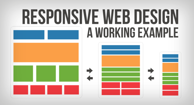
Below is the example of how the responsiveness of the website works. As the screen gets smaller, the content changes to the most effective display for each screen size.
Why should I care about mobile responsive design?
As a digital publisher, developer or designer, you should care about the responsiveness of the website because it will give your visitors the best experience possible, without forcing them to adapt on the website themselves.
There are two ways on how you can give your visitors a great experience with a responsive design:
1. Optimize the layout of your content
If your audience is using a mobile phone to browse your website, they generally don’t have a lot of space or screen to work with. Phones these days will automatically zoom out, for the whole website to be seen on screen. Even though it helps the reader see the entire website, it can also be frustrating for them if the information they are looking for is located in a tiny part of the screen. If you just move some things around, make some parts bigger and not have many columns, you’ll be able to give your mobile audience a better experience in browsing your website.
2. Adapt the content that’s shown
For example, you own a restaurant and a potential customer is looking at your website using his/her mobile phone, chances are they are not that bothered with how the look of your website - your food blog with amazing slideshow of your restaurant dishes scrolling from side to side won’t be very helpful in that situation. What they want to know is the time you are open, where you are located, how to create reservations and what’s on your menu.
Your potential customer who is browsing your website using a desktop computer probably isn’t looking to eat right now and isn’t in a hurry to know your location and your phone number. Most likely, he is interested to know if you have a good atmosphere and the kind of food you offer.
These are obvious generalizations, however you’ll be able to see the advantage of making different content presented to each device/screen size.
Responsive website design will take care of this “on the fly”, and without you having to maintain multiple versions of your site.
How to easily create a mobile responsive website?
This may be new to you, and fairly intimidating, since it doesn’t only require a change in the code and design, but also in your web strategy and philosophy.
However, you don’t have to worry that much in creating a mobile responsive web design, because we, at IFormatLogic I.T. Solutions, will help you in making your website responsive in any device/screen size.
Mobile responsive design is the future of the web
The main purpose of having a responsive web design is automatically delivering your visitors the content that they need, within the context that they’re using.
It’s revolutionary for online publishers, since responsive web design diminish the need for having many versions of your website or having an expensive app development and maintenance.


