What is Responsive Web Design?
Category: Design | Posted date: 2020-01-24 02:07:11 | Updated date: 2020-01-24 03:21:19 | Posted by: Jesza

How can websites possibly maintain with the many screens out there?
Responsive web design.
With the responsive web design, your website and all of its pages can adapt and produce the most effective experience to users, whether they’re on their desktop, laptop, tablet, or smartphone or any devices. For that to happen, your website needed a responsive design.
What is responsive web design, and how does it work?
Keep reading to seek out out, and see real-life samples of responsive web design!
What is responsive web design?
Responsive web design describes a web design approach that allows websites and pages to render (or display) on all devices and screen sizes by automatically adapting to the screen, whether it’s a desktop, laptop, tablet, or smartphone.
How does responsive web design work?
Responsive web design works through Cascading Style Sheets (CSS), using various settings to serve different style properties depending on the screen size, orientation, resolution, color capability, and other characteristics of the user’s device. a couple of samples of CSS properties associated with responsive web design include the viewport and media queries.
Is my website responsive?
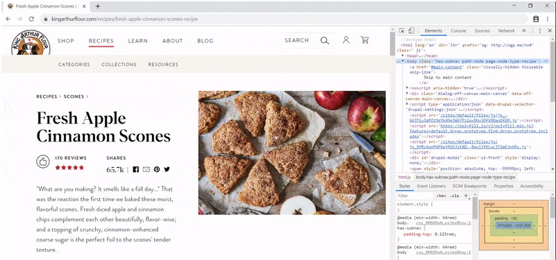
You can quickly see if a web site is responsive or not in your browser
- Open Google Chrome
- Go to your website
- Press Ctrl + Shift + I to open Chrome DevTools
- Press Ctrl + Shift + M to toggle the device toolbar
- View your page from a mobile, tablet, or desktop perspective
You can also use a free tool, like Google’s Mobile-Friendly Test, to ascertain if pages on your website are mobile-friendly. While you'll achieve mobile-friendliness with other design approaches, like adaptive design, responsive web design is that the most common due to its advantages.
Why responsive web design matters to web designers and business owners
Responsive web design relieves web designers, user interface designers, and web developers from working day and night develop websites for each single different devices. It also makes the lives of business owners, advertisers, and marketers easier.
Here are a few benefits:
- One site for every device: Whether viewed on a 27-inch iMac with a wireless connection or from the screen of your Android phone, the web site are going to be configured for the user’s optimal viewing pleasure.
- Optimal design for the device: With the responsive web design approach, all images, fonts, and other HTML elements are going to be scaled appropriately, maximizing whatever screen size the user has.
- No need for redirects: Other options towards designing for multiple devices require the utilization of redirects to send the user to the appropriate version of a web page. Without the necessity for redirects, the user can access the content he wants to seem at, as quickly as possible.
Responsive web design is additionally effective from a price standpoint. It’s also easier for you to manage because it’s one site versus two. You don’t need to make changes twice. Instead, you'll work from and update one website.
Examples of responsive web design
To see how responsive website design really works, go ahead and access the web from your smartphone and flick through some sites listed on mediaqueri.es — an internet gallery that features responsive web designs.
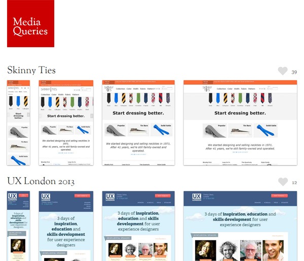
Now check out an equivalent sites on another Internet-enabled device like your laptop or your iPad. you'll also use DevTools in Chrome.
Notice how the pages alter their layouts to suit the device you’re on?
That’s responsive web design.
If you’re trying to find some professional assistance when it comes to making your website responsive, iFormatLogic can help. we provide responsive web design and development services, with over 1000 sites launched.
Email us at info.iformatlogic.com or contact us online to talk with a strategist about your site!


